Canyoudearreaderimaginehowharditwouldbetoquicklygraspthemeaningofthislineoftext
Or, can you, dear reader, see how much easier it is to quickly grasp the meaning of this line of text when properly punctuated?
The point of punctuation—the use of spacing, symbols and certain typographical devices—is to help the reader better understand the thoughts and cadence composed from a string of words. (I’d be willing to bet you paused for just a second when seeing a comma or an em dash in the above passage.) Without punctuation, we’d waste valuable time trying to determine where one word ended and the next began, all while struggling to quickly grasp its meaning.
There is no time for that in today’s busy world, where the average person is bombarded with 5,000 messages a day. It’s critical for corporate communications to quickly cut through the clutter and communicate to target audiences clearly, concisely and accurately. Punctuation helps make that possible.
One may think that punctuation would be solely the writer’s responsibility. After all, it’s their job to develop content—to determine what and how to say a message. And it’s the graphic designer’s role to determine how to best visually present that message. However, punctuation is part of our language, and it’s important to be familiar with how these marks look and how they work, regardless of one’s official title.
Those less detail oriented may overlook how the absence of properly placed punctuation can completely change the entire message. “Let’s bake, Grandma” and “Let’s bake Grandma” have entirely different meanings due to the inclusion or omission of the simple comma. We should each serve as a second set of eyes on every marketing piece produced to further ensure accuracy whether it is in raw text format of a Microsoft Word document or once the content is stylized in a professional design program such as Adobe InDesign.
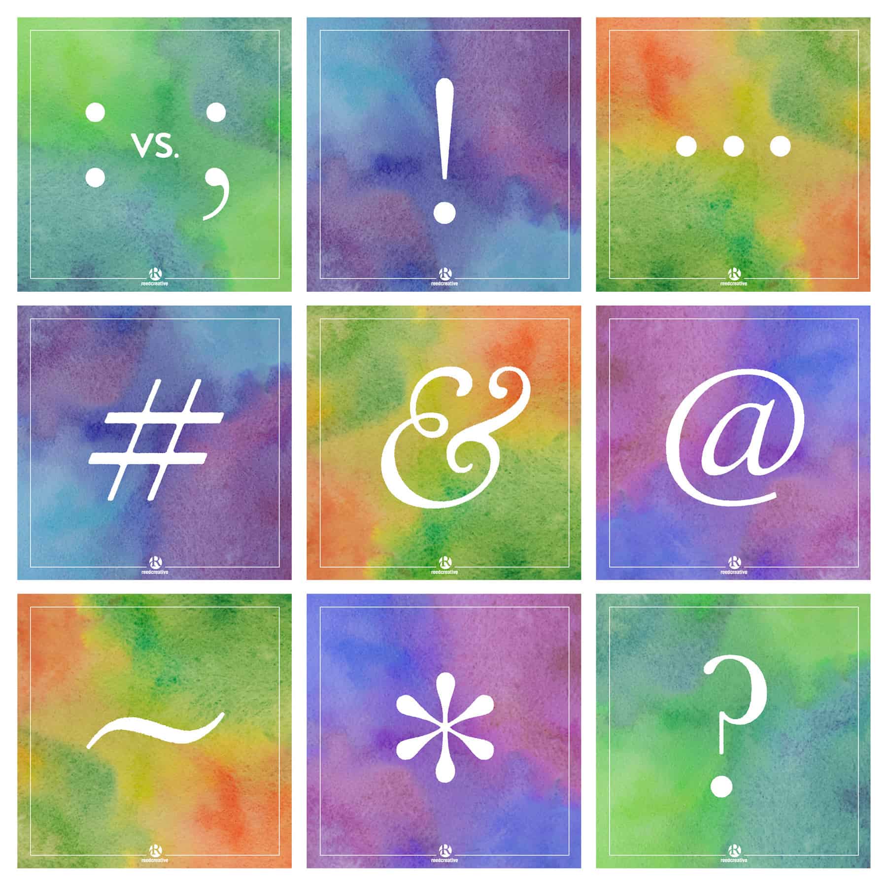
At Reed Creative, we obsess over the form and function of these special typographic characters. Don’t you adore how periods, question marks and exclamation marks precisely get their point across at a glance? Commas, colons and semicolons each hint at the proper pause with their ever-so-slight variation in appearance. And the history behind the beautiful ampersand is so intriguing! Earlier this year we highlighted some of our favorite marks on social media (Facebook & Instagram) to help creatives and clients better understand—and perhaps even develop a passion for—punctuation.
Corporate communication demands attention to detail if it is to demand your audience’s attention. Working with a professional team will make sure your message is accurate as well as visually and verbally compelling.
Additional resources from our studio bookshelves:
- The Golden Book on Writing by David Lambuth
- The Copyeditor’s Handbook by Amy Einsohn
- The Elements of Style by Strunk/White/Kalman
- Write Right by Jan Venolia
- The Associate Press Stylebook
:::::::::::::::::::::::
Reed Creative Owner, Lori Reed, has over 20 years of professional, nationwide experience in the graphic design industry. Her goal is to help brands make the best impression on target audiences through effective visual communication. If you found this helpful, let her know! She loves sharing her extensive knowledge and is available to speak or train your organization on the topics of design and copyediting.